

Calenor Pendant Light Vintage Rustic

Sale price£59.99

Colour: Silver
Description

Inspiration

The Peppa Vintage Pendant Light, blends modern durability with timeless elegance. Its captivating cone shape comes in silver, blue, green, cream, or yellow, illuminating living rooms, dining rooms, bedrooms, or restaurants with style and substance.
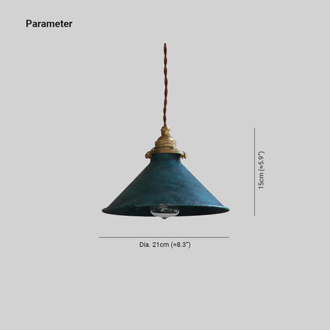
Product Details
Type Pendant Light
Style Peppa
Suggested Space Fit Kitchen/Balcony
Suggested Room Size 5-10m²
Indoor or Outdoor Use Indoor
Dimmable No
Colour Temperature Warm Light
Smart Enabled /
Need Assembly Yes
IP Rate IP20
Power Source Hardwire
Light Source 
Bulb Included No
Bulb Type LED/Incandescent/Fluorescent
Bulb Base E14
Number of Bulb 1
Voltage (V) 110-240V
Maximum Wattage(W) /
Material
Primary Material Metal
Fixture Material Metal
Shade Material Metal
Dimensions
Product Weight /
Chain/Cord Adjustable or Not Yes
Size See Images
Package Contents
1* Pendant Light
Note
The size is manually measured, there will be an error of 1-3cm. Because of the difference in light, there may be slight chromatic aberration. We appreciate your understanding in advance. We recommend that you'd better let a professional electrician to install it


  • 5 stars: 30 (91%)
  • 4 stars: 3 (9%)
  • 3 stars: 0 (0%)
  • 2 stars: 0 (0%)
  • 1 star: 0 (0%)
E
Eleanor L. Thompson
Flowing Silhouette

The broad conical form anchors the vertical lines beautifully, creating a sense of movement that feels gentle and naturally composed within the room.

R
Ronnie Wallace
Considered with everyday furniture

We haven't changed anything else around it, which tells me the design is doing its job. I was slightly nervous about ordering a light I hadn't seen in person, especially because scale is hard to judge online. The finish looks considered rather than excessively polished, which suits our home. The material keeps the design from looking mass-produced. The metal changes subtly as the daylight moves, which gives the fitting a different feel through the day.

D
Daniel Q. Turner
Warm Presence

I find the muted atmosphere incredibly grounding. It balances industrial character with artistry, resulting in a piece that feels quietly refined rather than loud.

A
Amelia P. Evans
Visual Rhythm

Subtle textural variations define the visual presence, drawing the eye downward with deliberate simplicity. This lighting fixture offers an artistic presence that balances industrial traits with a muted, refined atmosphere.

I
Isaac U. Kelly
Artistic Balance

Industrial character meets artistic expressiveness in this restrained design. You will appreciate how structural harmony supports its quiet elegance without excessive ornamentation.

B
Bryn Kerr
Relaxed for our room

The green finish is more nuanced in daylight than it looked on my screen. It looks intentional without giving the impression that the room was designed around the light. We weren't trying to follow a particular interiors trend; we just wanted something with a bit of character. The material keeps the design from looking mass-produced. For our living room, I prefer that it feels considered rather than overtly decorative.

E
Evelyn Routledge
Strong from different angles

The green mainly defines the form rather than turning into a statement colour of its own. The previous fitting was very plain and functional, so this was a fairly big visual change for us. I like that it has detail without looking busy. From nearby the material is interesting, while from a distance the overall shape stays clean. The green finish helps the outline sit comfortably with the other finishes already in the room.

I
Isabella Underhill
Smart at home

The LED setup keeps the appearance clean and straightforward. The room needed a focal point, although I didn't want to add more furniture or wall decoration. It has one character in daylight and another in the evening, and I like both. The scale works with the furniture around it rather than making everything else look secondary. In our living room, that balance between the fitting and the empty space around it is especially important.

E
Evelyn Kerr
Convincing with the material

The metal and the shape work together more convincingly in person than in the product photographs. I would use the same design again in another room with similar proportions. The online photos made it look quite bold, but I hoped it would soften once it was surrounded by furniture. The material is much easier to appreciate when you walk past it at close range. The green reads as part of the form rather than a separate decorative statement.

E
Ella Watson
Characterful after a few weeks

The size ended up being exactly what the space needed. We have a mixture of finishes in the room, so I needed a light that didn't demand a perfectly matched scheme. I actually appreciate it more now than I did on installation day. In our living room, the proportions are very comfortable; it is noticeable without swallowing the space. The metal changes subtly as the daylight moves, which gives the fitting a different feel through the day.

P
Penelope Grant
Convincing in person

The outline changes a little as you move around the room, which makes it more interesting in person. The novelty has worn off, but the appeal hasn't. I was drawn to the material first and only really appreciated the shape after it arrived. It has been surprisingly easy to incorporate into everyday life. In the living room, the shape has enough interest without asking everything else to match it.

S
Sienna Ingham
Relaxed up close

I saved this one while comparing several fittings and kept coming back to the shape. The green finish is more nuanced in daylight than it looked on my screen. It has settled into the room rather than becoming something that constantly asks for attention. The daylight view is probably my favourite. In the living room, the shape has enough interest without asking everything else to match it.

C
Caroline T. Simmons
Atmospheric Balance

It creates a calm, sophisticated backdrop without shouting for attention. The visual weight feels grounded yet light, offering a quiet confidence.

A
Ava Simpson
Considered as part of the room

The shape looks simple from a distance and reveals more detail as you get closer. It looks intentional without giving the impression that the room was designed around the light. The room needed a focal point, although I didn't want to add more furniture or wall decoration. It feels like a thoughtful upgrade rather than a complete style change. The metal changes subtly as the daylight moves, which gives the fitting a different feel through the day.

C
Charlotte Townend
Lovely in the evening

The fitting looks substantial without becoming bulky. The previous fitting was very plain and functional, so this was a fairly big visual change for us. The LED setup keeps the appearance clean and straightforward. It has settled into the room rather than becoming something that constantly asks for attention. In the living room, the shape has enough interest without asking everything else to match it.

O
Osian Green
Relaxed from different angles

The size ended up being exactly what the space needed. I wanted the light to feel decorative without making the room look formal. It gives the room personality without dictating the rest of the décor. The metal has more depth in person, and the surface stops the pendant light from feeling flat. In our living room, that balance between the fitting and the empty space around it is especially important.

C
Caroline W. Watson
Elegant industrial blend

The lighting feels like a quiet partner to the room's decor, creating a balanced mood without shouting for attention. It is slightly more traditional than my usual style, but the sophisticated restraint works well here.

B
Beth Morgan
Subtle once fitted

It has made the lighting feel like part of the interior rather than just a practical necessity. We chose this for a part of the house that gets used every day, so it needed to be easy to live with. The green is easier to combine with other finishes than I expected. I was pleased that it didn't force us to change anything else. The green reads as part of the form rather than a separate decorative statement.

R
Ralph McAllister
Thoughtful up close

The only reason for four stars is that choosing the right size needs a little more thought than the photos suggest. We have a mixture of finishes in the room, so I needed a light that didn't demand a perfectly matched scheme. I would use the same design again in another room with similar proportions. The proportions are what make the design feel deliberate rather than merely decorative. The metal changes subtly as the daylight moves, which gives the fitting a different feel through the day.

F
Fraser Evans
Convincing in daylight

The online photos made it look quite bold, but I hoped it would soften once it was surrounded by furniture. I notice the shape more than the colour, which is what I wanted. With normal furniture around it, the design feels calmer than it does against a blank product background. The result is quieter than I expected, in a good way. For this pendant light, the metal is the detail that makes the design feel specific rather than interchangeable.

R
Ralph Richardson
Strong once fitted

The scale works with the furniture around it rather than making everything else look secondary. I was slightly nervous about ordering a light I hadn't seen in person, especially because scale is hard to judge online. The material keeps the design from looking mass-produced. It looks intentional without giving the impression that the room was designed around the light. For our living room, I prefer that it feels considered rather than overtly decorative.

S
Stella A. Ross
A Quiet Masterpiece

I anticipated something loud and bold, but the reality is far more compelling. The vertical rhythm guides the gaze smoothly down to that broad conical shape, creating a sense of calm structure. It feels like a deliberate artistic statement rather than just a light.

L
Lillian F. Gray
Graceful Favorite

It feels like a quiet, sophisticated pause in the room. The vertical rhythm draws the eye downward to that broad conical shape with such deliberate simplicity. There is a subtle textural depth here that avoids ornamentation entirely. It balances industrial character with artistic grace effortlessly. I find myself returning to this visual presence again and again. It offers a restrained elegance that feels both modern and timeless without trying too hard.

M
Mason G. Gray
Quietly Striking Silhouette

The downward flow of this fixture feels intentionally crafted, guiding attention to that broad conical shape without shouting for it. There’s a calm elegance here, a balance between structure and artistry that avoids clutter. It brings a sophisticated, unhurried presence to the space, feeling both distinctive and comfortably approachable in its simplicity.

A
Audrey E. Thompson
Timeless Style

The refined look avoids any fleeting trends, feeling instead like a thoughtful, enduring addition to the space.

H
Henry O. Ward
Intentional Elegance

I assumed the industrial vibe would feel heavy, yet the vertical rhythm and broad conical form create a surprisingly light presence. The structural harmony lends an air of deliberate simplicity to the room, making the space feel curated rather than accidental. It is a quiet sophistication that transforms the area into something truly intentional.

S
Sophie J. Foster
Sculptural Calm

It has this sharp, artistic edge but still manages to keep things cozy. I did not expect such a warm vibe from something so structurally defined, but it works perfectly together.

E
Elena Y. Turner
Quiet Elegance

The mood felt exactly as imagined, a serene balance of structure and softness that settles gently into the room.

C
Chloe Z. Jackson
Downward Flow

I was struck by how the vertical rhythm naturally guides the eye downward. It feels like a deliberate artistic choice rather than mere decoration.

S
Samuel K. Scott
Thoughtful Balance

My immediate reaction is one of appreciation for such thoughtful visual balance and restrained character.