

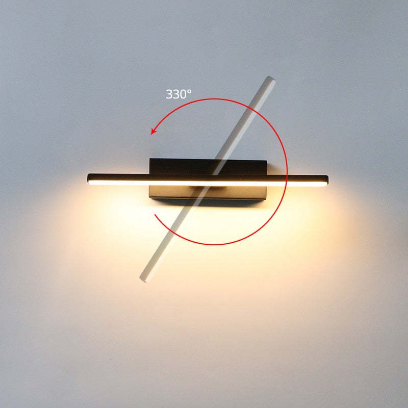
Darin Rotatable Wall Lamp for Bedroom, Black/White

Sale price£69.99

Lampshade Color: Black
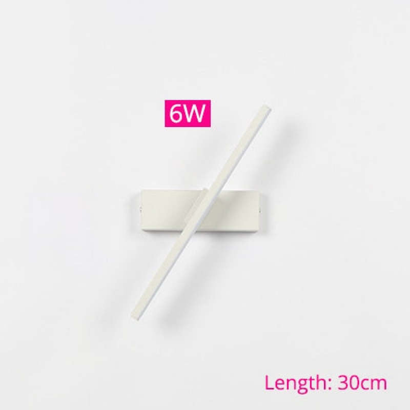
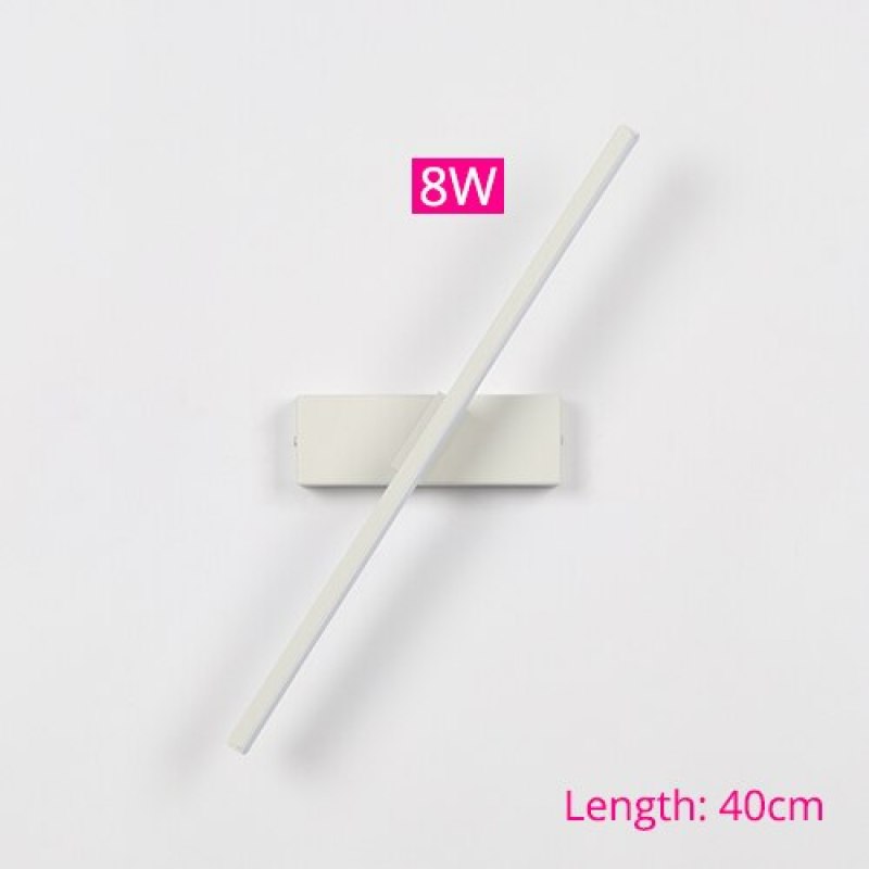
Length: 30 cm
Color Temperature: Warm White (2700-3500K)
Description
Product Details
Type Indoor Wall Lamp
Style Struve
Suggested Space Fit Living Room/Bedroom/Dining Room
Suggested Room Size 15㎡-20㎡
Indoor or Outdoor Use Indoor
Dimmable No
Colour Temperature Warm Light/Cold Light/Natural Light
Smart Enabled /
Need Assembly Yes
IP Rate IP20
Power Source Hardwire
Light Source
Bulb Included Yes
Bulb Type LED
Bulb Base SMD
Number of Bulb 1
Voltage (V) 110V-240V
Maximum Wattage(W) /
Material
Primary Material Metal+Acrylic
Fixture Material Metal
Shade Material Acrylic
Dimensions
Product Weight /
Chain/Cord Adjustable or Not No
Size See Images
Package Contents
1* Indoor Wall Lamp
Note
The size is manually measured, there will be an error of 1-3cm. Because of the difference in light, there may be slight chromatic aberration. We appreciate your understanding in advance. We recommend that you'd better let a professional electrician to install it

Inspiration

  • Discover the perfect fusion of enduring durability and timeless style with our Rotatable Wall Lamp. Expertly crafted from premium metal and acrylic, this lamp is a testament to lasting elegance that seamlessly integrates into any room.
  • Elevate your living spaces with the exquisite Rotatable Wall Lamp, available in two versatile colour options: white and black. Choose the colour that effortlessly complements your existing decor, allowing you to bask in the opulent illumination it provides.
  • 5 stars: 28 (93%)
  • 4 stars: 2 (7%)
  • 3 stars: 0 (0%)
  • 2 stars: 0 (0%)
  • 1 star: 0 (0%)
L
Lucas Lewis
A focal point with grace

Its architectural clarity commands attention without shouting. The deliberate simplicity allows the negative space to speak volumes about the design's intention.

F
Felix Whitfield
Convincing for our room

It looks intentional without giving the impression that the room was designed around the light. The previous fitting was very plain and functional, so this was a fairly big visual change for us. In our living room, the proportions are very comfortable; it is noticeable without swallowing the space. Being able to rotate it makes it easier to direct the light where it is actually useful. The metal provides enough detail that the area doesn't need much else visually.

R
Ralph Fraser
Smart with the material

I liked the product photos, but I wasn't sure how the design would sit with ordinary furniture. The warmer light is particularly pleasant in the evening and doesn't feel harsh. The shape looks simple from a distance and reveals more detail as you get closer. I actually appreciate it more now than I did on installation day. The metal provides enough detail that the area doesn't need much else visually.

A
Abigail Ratcliffe
Convincing for our room

The outline changes a little as you move around the room, which makes it more interesting in person. I nearly went for a safer design, but this had enough personality to make the room feel different. It feels like a thoughtful upgrade rather than a complete style change. The novelty has worn off, but the appeal hasn't. In the living room, the shape has enough interest without asking everything else to match it.

W
Wesley Taylor
Restrained Aesthetic

It avoids flashy decor in favor of precise structural alignment, establishing an artistic character through negative space alone.

B
Benjamin Williams
Architectural Clarity

I feared it might feel too stark, yet the intersecting lines create a warm rhythm that feels intentionally balanced rather than cold.

E
Evie Robertson
Characterful with the material

We had been meaning to replace the old light for ages, and this was the first one that felt worth the change. The outline changes a little as you move around the room, which makes it more interesting in person. The design is memorable without becoming tiring to look at. It has enough presence that we didn't need another decorative piece nearby. The black reads as part of the form rather than a separate decorative statement.

J
James McKenzie
Thoughtful with the material

I was drawn to the material first and only really appreciated the shape after it arrived. We see the fitting from several positions, and the design holds together from all of them. A month or so later, I'm still pleased we chose the less obvious option. The finish works well with both warm and cooler tones already in the room. The metal provides enough detail that the area doesn't need much else visually.

S
Stanley Kilner
Convincing up close

The black finish is more nuanced in daylight than it looked on my screen. I wanted the light to feel decorative without making the room look formal. I notice the shape more than the colour, which is what I wanted. The novelty has worn off, but the appeal hasn't. With this design, getting the proportions right matters more than adding decoration around it.

L
Lucy Grimsditch
Well balanced up close

I wanted the light to feel decorative without making the room look formal. After a few days, the shape stopped feeling 'new' and simply became part of the room. A month or so later, I'm still pleased we chose the less obvious option. I especially like seeing it from the doorway. What works particularly well here is that the wall light leaves the living room feeling open.

M
Miles Young
Calm visual presence

The mood feels quiet and composed, bringing a sense of stillness to the space. It relies on form rather than noise to make its statement.

G
Gethin Cooper
Characterful day to day

It has been easy to live with, which matters more to me than making a dramatic first impression. I was looking for something less generic, but still calm enough for an everyday home. The design has presence at eye level without making the room feel busy. I especially like seeing it from the doorway. For this wall light, the metal is the detail that makes the design feel specific rather than interchangeable.

H
Harper Whitaker
Strong as part of the room

The fitting looks substantial without becoming bulky. It has become one of those details you notice gradually rather than all at once. We weren't trying to follow a particular interiors trend; we just wanted something with a bit of character. The design feels calmer once the room is actually being used. The wall light feels much more relaxed in a real home than it does against a plain product background.

P
Poppy Watts
Thoughtful in the evening

I notice the shape more than the colour, which is what I wanted. The previous fitting was very plain and functional, so this was a fairly big visual change for us. I would use the same design again in another room with similar proportions. The black is easier to combine with other finishes than I expected. For this wall light, the metal is the detail that makes the design feel specific rather than interchangeable.

N
Nellie Procter
Characterful for the space

The material keeps the design from looking mass-produced. We have a mixture of finishes in the room, so I needed a light that didn't demand a perfectly matched scheme. The space feels more complete now, but still like a normal home rather than a styled set. The scale works with the furniture around it rather than making everything else look secondary. For our living room, I prefer that it feels considered rather than overtly decorative.

R
Rose Watson
Convincing in daylight

It has been surprisingly easy to incorporate into everyday life. I was looking for something less generic, but still calm enough for an everyday home. The finished room feels more relaxed than I expected from the product photos. The design has presence at eye level without making the room feel busy. For our living room, I prefer that it feels considered rather than overtly decorative.

G
Grace Bennett
Strong after a few weeks

I was looking for something less generic, but still calm enough for an everyday home. It has made that corner of the room feel much less forgotten. With normal furniture around it, the design feels calmer than it does against a blank product background. The overall change is subtle, yet the room definitely feels better balanced. The way the wall light sits with ordinary furniture is one of the reasons it has worked for us.

R
Ralph Trelawney
Characterful with the material

We wanted something that would look considered during the day, not only when the light was switched on. Nearly five stars from us. It benefits from having enough clear space around it, so placement is worth considering. The black finish is more nuanced in daylight than it looked on my screen. The overall change is subtle, yet the room definitely feels better balanced. The metal changes subtly as the daylight moves, which gives the fitting a different feel through the day.

A
Alice Campbell
Nicely judged from different angles

I liked the product photos, but I wasn't sure how the design would sit with ordinary furniture. The fitting doesn't rely on ornate details; the overall form does most of the work. We haven't changed anything else around it, which tells me the design is doing its job. The material is much easier to appreciate when you walk past it at close range. The wall light feels much more relaxed in a real home than it does against a plain product background.

W
Wesley Richardson
Balanced Elegance

The rhythmic balance of the design feels intentional and calm. It relies on form rather than detail, establishing an artistic character within the negative space that invites quiet observation.

S
Sebastian Fisher
Quiet Elegance

The interplay of lines creates a striking yet calm presence, balancing artistic flair with structural discipline.

E
Evelyn Campbell
Controlled Geometry

I admire how the intersecting forms achieve such rhythmic balance without overwhelming the surrounding space. It feels like intentional architecture rather than mere decoration.

N
Nathan Reynolds
Quiet Geometry

The diagonal crossing the horizontal base offers a subtle tension that elevates the wall without shouting. It brings a calm presence to the room.

D
Dylan Reynolds
Geometric charm for simple walls

This adds character to a plain room, though it leans slightly simpler than my usual preference. Still, the architectural clarity works well here.

E
Evelyn Powell
Striking Geometry

I would suggest this to anyone who enjoys architectural forms. The intersecting lines create a dynamic tension that changes depending on where you stand, offering a fresh perspective from every angle without relying on ornamentation.

T
Thomas Murphy
Dynamic Rhythm

The intersecting lines create a quiet, architectural balance that feels both deliberate and calm. Its minimal structure offers elegance without clutter, establishing a serene presence through pure form rather than ornamentation.

D
Daniel Morris
Quietly striking geometry

The intersecting lines create such a calm, rhythmic balance that it feels more like modern art than a simple light.

B
Benjamin Henderson
Timeless geometric appeal

The style feels refined and deliberate rather than chasing any passing trend. There is something about the precise alignment that makes it feel established and permanent in the space.

D
Dylan Morris
Unexpected Serenity

While I anticipated something bold, the actual mood is surprisingly tranquil. The geometric tension holds its own quietly, establishing a refined atmosphere that feels both modern and deeply considered.

L
Lydia Fisher
Memorable yet subtle

I find myself noticing the balance of forms more than I notice other items on the wall. It has a memorable quality that does not overwhelm the room or compete with other elements. The artistic character emerges naturally through structure alone.