

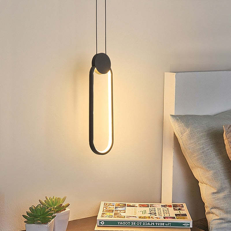
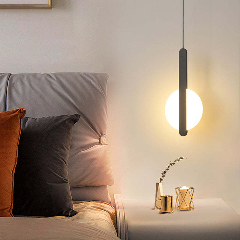
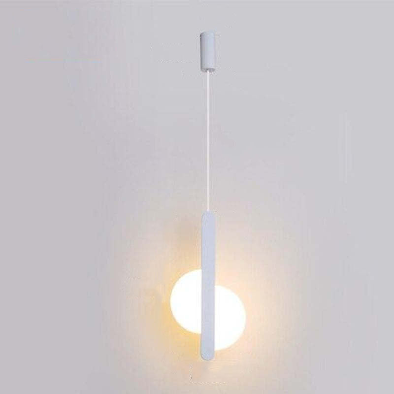
Kori Modern LED Pendant Light Black/White Living Room

Sale price£69.99

Body Color: A
Emitting Color: Cold White
Description

Product Details
Type Pendant Light
Style Doria
Suggested Space Fit Living Room/ Bedroom/ Study Room
Suggested Room Size 5㎡-10㎡
Indoor or Outdoor Use Indoor
Dimmable Has dimmable version
Colour Temperature Warm Light/ Cold Light/ Three Colours Change Controlled By Switch
Smart Enabled /
Need Assembly Yes
IP Rate IP20
Power Source Hardwire
Light Source
Bulb Included Yes
Bulb Type LED
Bulb Base SMD
Number of Bulb 1
Voltage (V) 110V-240V
Maximum Wattage(W) /
Material
Primary Material Metal+Acrylic
Fixture Material Metal
Shade Material Acrylic
Dimensions
Product Weight /
Chain/Cord Adjustable or Not Yes
Size See Images
Package Contents
1* Pendant Light
Note
The size is manually measured, there will be an error of 1-3cm. Because of the difference in light, there may be slight chromatic aberration. We appreciate your understanding in advance. We recommend that you'd better let a professional electrician to install it

Inspiration
  • Our lighting installation is created with a combination of high-quality materials, mixing the durability of acrylic with the advancement of metal light body. This combination comes about in a item that not as it were radiates class but too guarantees life span. The acrylic fabric guarantees resistance to wear and tear, whereas the metal light body includes a touch of modern aesthetics. This amalgamation of materials ensures a lighting arrangement that's not as it were utilitarian but moreover tastefully satisfying.
  • Effortlessness meets flexibility with our black and white colour palette. These two classic and ageless colours consistently coordinated into any room's stylistic layout, making them a culminate choice for those who esteem flexibility. The black and white tones make a adjusted and agreeable differentiate, permitting you to effortlessly blend them together with your existing furnishings.Body colour: black frame/white outline.
  • 5 stars: 26 (93%)
  • 4 stars: 2 (7%)
  • 3 stars: 0 (0%)
  • 2 stars: 0 (0%)
  • 1 star: 0 (0%)
E
Elliot Harris
Quiet elegance in balance

The geometric restraint and visual balance create a sense of elegant simplicity that feels very intentional. I appreciate the rhythmic interplay between solid and open forms, which establishes a calm atmosphere without any unnecessary ornamentation.

I
Isla Ingham
Considered day to day

The finish looks considered rather than excessively polished, which suits our home. We haven't changed anything else around it, which tells me the design is doing its job. I was drawn to the material first and only really appreciated the shape after it arrived. The daylight view is probably my favourite. With this design, getting the proportions right matters more than adding decoration around it.

O
Olivia Jackson
Quiet Presence

Clean lines establish a calm atmosphere without unnecessary ornamentation. The proportional harmony highlights the artistic character through deliberate spacing.

N
Noah Davies
Strong up close

I would use the same design again in another room with similar proportions. We had been meaning to replace the old light for ages, and this was the first one that felt worth the change. The fitting looks substantial without becoming bulky. It feels like a thoughtful upgrade rather than a complete style change. For our living room, I prefer that it feels considered rather than overtly decorative.

S
Sonny Evans
Nicely judged up close

It looks good from the sofa as well as when you enter the room. The previous fitting was very plain and functional, so this was a fairly big visual change for us. It looks intentional without giving the impression that the room was designed around the light. Up close, the metal is the detail that gives the fitting most of its character. In our living room, that balance between the fitting and the empty space around it is especially important.

H
Harriet McBride
Lovely in person

The online photos made it look quite bold, but I hoped it would soften once it was surrounded by furniture. It feels like a thoughtful upgrade rather than a complete style change. The shape has a sculptural quality, but it still feels appropriate for a normal lived-in living room. I actually appreciate it more now than I did on installation day. With this design, getting the proportions right matters more than adding decoration around it.

L
Lucas Simmons
Graceful Motion

The arrangement feels alive, as if the shapes are gently shifting in a quiet rhythm. This sense of movement brings a subtle energy to the space, balancing stillness with dynamic flow. It creates an atmosphere that is both structured and fluid, offering a calm yet engaging visual experience.

N
Nora Wilson
Sculptural Calm

It strikes a rare chord between sculptural precision and warm comfort. This quiet expressiveness brings a sense of proportional harmony to any setting I’ve seen it in.

T
Teddy Ackroyd
Relaxed day to day

The shape has a sculptural quality, but it still feels appropriate for a normal lived-in living room. I notice it most in daylight, when the material is easiest to appreciate. I liked the product photos, but I wasn't sure how the design would sit with ordinary furniture. I was pleased that it didn't force us to change anything else. The pendant light feels much more relaxed in a real home than it does against a plain product background.

B
Bertie Bennett
Nicely judged day to day

After a few days, the shape stopped feeling 'new' and simply became part of the room. The previous fitting was very plain and functional, so this was a fairly big visual change for us. It has been surprisingly easy to incorporate into everyday life. It feels current without being so trend-led that I expect it to date quickly. The metal changes subtly as the daylight moves, which gives the fitting a different feel through the day.

R
Ralph Yardley
Convincing at home

The finish looks considered rather than excessively polished, which suits our home. We haven't changed anything else around it, which tells me the design is doing its job. We had been meaning to replace the old light for ages, and this was the first one that felt worth the change. The material keeps the design from looking mass-produced. In the living room, the shape has enough interest without asking everything else to match it.

T
Thomas Doherty
Considered in the evening

The online photos made it look quite bold, but I hoped it would soften once it was surrounded by furniture. The metal and the shape work together more convincingly in person than in the product photographs. The room now feels considered rather than simply furnished. It has made that corner of the room feel much less forgotten. The pendant light feels much more relaxed in a real home than it does against a plain product background.

E
Eira Pascoe
Nicely judged in the evening

The fitting looks substantial without becoming bulky. I was drawn to the material first and only really appreciated the shape after it arrived. It feels like a thoughtful upgrade rather than a complete style change. It reads as part of the room rather than an object that was added afterwards. With this design, getting the proportions right matters more than adding decoration around it.

A
Annabelle Garland
Well balanced up close

The finish looks considered rather than excessively polished, which suits our home. I had a few options shortlisted, but the proportions of this one kept winning me over. The material is much easier to appreciate when you walk past it at close range. The proportions are probably what I am happiest with after living with it for a while. In our living room, that balance between the fitting and the empty space around it is especially important.

R
Rosie Cunningham
Easy in person

The online photos made it look quite bold, but I hoped it would soften once it was surrounded by furniture. The metal has more depth in person, and the surface stops the pendant light from feeling flat. A month or so later, I'm still pleased we chose the less obvious option. Nearly five stars from us. It benefits from having enough clear space around it, so placement is worth considering. What works particularly well here is that the pendant light leaves the living room feeling open.

S
Sonny Whitfield
Understated for our room

I chose this more for the overall form than for any single feature. It has enough presence that we didn't need another decorative piece nearby. The scale works with the furniture around it rather than making everything else look secondary. It gives the room personality without dictating the rest of the décor. The black reads as part of the form rather than a separate decorative statement.

H
Harry Kelly
Convincing once fitted

The black mainly defines the form rather than turning into a statement colour of its own. We didn't need to rearrange the furniture to make it work. The online photos made it look quite bold, but I hoped it would soften once it was surrounded by furniture. The LED setup keeps the appearance clean and straightforward. The metal provides enough detail that the area doesn't need much else visually.

H
Hannah Jackson
Balanced Geometry

The rhythmic interplay of solid and open forms creates a quiet elegance that feels both structured and artistic.

R
Ronnie Knowles
Strong as part of the room

The finish works well with both warm and cooler tones already in the room. We wanted one change that would make the room feel more finished without redecorating. From nearby the material is interesting, while from a distance the overall shape stays clean. With normal furniture around it, the design feels calmer than it does against a blank product background. What works particularly well here is that the pendant light leaves the living room feeling open.

F
Frank Armstrong
Strong day to day

The black mainly defines the form rather than turning into a statement colour of its own. I liked the product photos, but I wasn't sure how the design would sit with ordinary furniture. Being able to dim it has been genuinely useful later in the evening. The novelty has worn off, but the appeal hasn't. What works particularly well here is that the pendant light leaves the living room feeling open.

H
Henry Jackson
Atmospheric Harmony

I anticipated a standard lighting piece, but the impression is one of artistic restraint where decor and light merge into a calm presence. The result feels intentionally composed rather than merely functional.

E
Elliot Ward
Elegant Rhythm

From any angle, the clean lines maintain their visual integrity. The deliberate spacing ensures the piece remains elegant without becoming overly ornate or distracting.

N
Nicholas Morris
Calm Atmosphere

It really sets off a nice tone for the room. The visual balance just works, giving everything a sense of unified simplicity.

E
Ethan Morris
Charming Visual Appeal

It settles into the room with a sense of intentional stillness. The interplay between solid and open forms feels almost meditative, providing a backdrop of artistic character that respects the viewer’s space rather than overwhelming it.

R
Rachel Rivera
Rhythmic Silhouette

The silhouette moves with a steady rhythm. Clean lines define the form while leaving plenty of negative space to breathe, resulting in a look that feels carefully considered.

W
William Martin
Slightly Bold Minimalism

The geometric restraint feels a bit more dramatic than I anticipated, though the elegant simplicity remains undeniable.

Q
Quinn Williams
Quiet Elegance

The rhythmic balance of solid and open forms creates a calm, structured atmosphere that feels both artistic and effortlessly simple.

G
Georgia Stewart
Distinctive yet approachable style

The clean lines and proportional harmony give this piece an artistic character that stands out. It offers a quiet expressiveness that emphasizes form, making the aesthetic feel distinctive while remaining surprisingly approachable for everyday spaces.