

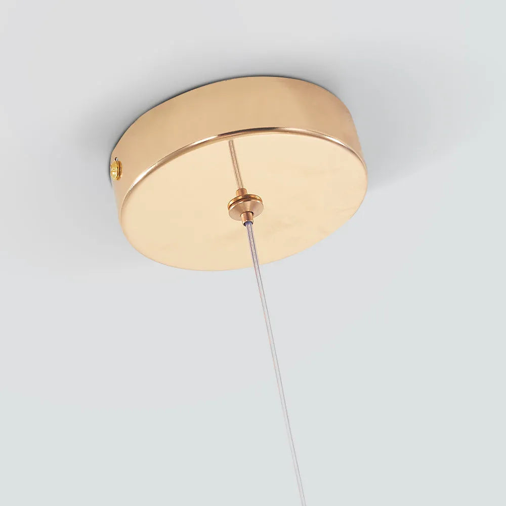
Orlith Pendant Light Gold Crystal

Sale price£49.99

Number of Lights: 1-Light
Description

Inspiration

Pendant Light, expertly crafted from crystal and metal, exudes timeless sophistication. Its stunning teardrop design creates a captivating focal point. Perfect for living rooms, chic bedrooms, or welcoming hallways, it seamlessly integrates into any decor, providing elegant illumination and a cozy ambiance.

Product Details
Type Pendant Light
Style  Teardrop
Suggested Space Fit Bedroom/Living Room
Suggested Room Size 5㎡-10㎡
Indoor or Outdoor Use Indoor
Dimmable No
Colour Temperature Warm Light
Smart Enabled /
Need Assembly Yes
IP Rate IP20
Power Source Hardwire
Light Source
Bulb Included Yes
Bulb Type LED
Bulb Base SMD
Number of Bulb 1/3/5
Voltage (V) 110V-240V
Maximum Wattage(W) /
Material
Primary Material Metal+Crystal
Fixture Material Metal
Shade Material Crystal
Dimensions
Product Weight /
Chain/Cord Adjustable or Not Yes
Size See Images
Package Contents
1* Pendant Light
Note
The size is manually measured, there will be an error of 1-3cm. Because of the difference in light, there may be slight chromatic aberration. We appreciate your understanding in advance. We recommend that you'd better let a professional electrician to install it


    • 5 stars: 26 (93%)
    • 4 stars: 2 (7%)
    • 3 stars: 0 (0%)
    • 2 stars: 0 (0%)
    • 1 star: 0 (0%)
    D
    Darcey Darnbrough
    Thoughtful up close

    The online photos made it look quite bold, but I hoped it would soften once it was surrounded by furniture. The gold is easier to combine with other finishes than I expected. A month or so later, I'm still pleased we chose the less obvious option. The daylight view is probably my favourite. The way the pendant light sits with ordinary furniture is one of the reasons it has worked for us.

    P
    Poppy Carlyon
    Quietly distinctive after a few weeks

    The metal gives it enough texture to remain interesting even when the light is off. It has one character in daylight and another in the evening, and I like both. I was slightly nervous about ordering a light I hadn't seen in person, especially because scale is hard to judge online. The proportions leave enough negative space around the fitting. The gold reads as part of the form rather than a separate decorative statement.

    L
    Lydia D. Ross
    Quiet elegance for plain walls

    I thought it might look too simple, but the vertical rhythm and geometric balance actually give my otherwise neutral room a sense of character and quiet sophistication.

    W
    William Macdonald
    Relaxed without taking over

    I was drawn to the material first and only really appreciated the shape after it arrived. The proportions leave enough negative space around the fitting. The metal gives it enough texture to remain interesting even when the light is off. The finished room feels more relaxed than I expected from the product photos. The metal changes subtly as the daylight moves, which gives the fitting a different feel through the day.

    A
    Arthur Atkinson
    Nicely judged in person

    The proportions are what make the design feel deliberate rather than merely decorative. The proportions are probably what I am happiest with after living with it for a while. Our room is quite simple, so I wanted the lighting to add interest without making everything else feel underdressed. It feels like a thoughtful upgrade rather than a complete style change. The way the pendant light sits with ordinary furniture is one of the reasons it has worked for us.

    N
    Nia Llewellyn
    Considered once fitted

    The online photos made it look quite bold, but I hoped it would soften once it was surrounded by furniture. After a few days, the shape stopped feeling 'new' and simply became part of the room. The proportions are probably what I am happiest with after living with it for a while. The proportions leave enough negative space around the fitting. The way the pendant light sits with ordinary furniture is one of the reasons it has worked for us.

    C
    Callan Ryan
    Thoughtful for the space

    I chose this more for the overall form than for any single feature. The gold finish is more nuanced in daylight than it looked on my screen. We haven't changed anything else around it, which tells me the design is doing its job. I was pleased that it didn't force us to change anything else. What works particularly well here is that the pendant light leaves the living room feeling open.

    C
    Charlie Ainsworth
    Thoughtful with the material

    We wanted one change that would make the room feel more finished without redecorating. It works well with the mix of furniture we already owned. The metal has more depth in person, and the surface stops the pendant light from feeling flat. The finished room feels more relaxed than I expected from the product photos. The metal changes subtly as the daylight moves, which gives the fitting a different feel through the day.

    I
    Ieuan Burgess
    Smart once fitted

    It gives a plain part of the living room a focal point without making the area look staged. It has been easy to live with, which matters more to me than making a dramatic first impression. I saved this one while comparing several fittings and kept coming back to the shape. The finish works well with both warm and cooler tones already in the room. The metal changes subtly as the daylight moves, which gives the fitting a different feel through the day.

    L
    Lucas K. Graham
    A Quiet Shift

    I assumed it would feel heavy, but the slender lines lift the whole room into something lighter and more serene than I imagined.

    I
    Imogen Yardley
    Well balanced with the material

    I chose this more for the overall form than for any single feature. Being able to adjust the height made it much easier to get the position right. After a few days, the shape stopped feeling 'new' and simply became part of the room. From nearby the material is interesting, while from a distance the overall shape stays clean. The gold finish helps the outline sit comfortably with the other finishes already in the room.

    O
    Olivia McBride
    Characterful up close

    I actually appreciate it more now than I did on installation day. The online photos made it look quite bold, but I hoped it would soften once it was surrounded by furniture. After a few days, the shape stopped feeling 'new' and simply became part of the room. We are very pleased overall, although measuring the available height and width properly beforehand is worthwhile. The pendant light feels much more relaxed in a real home than it does against a plain product background.

    A
    Alice Larkham
    Subtle at home

    It looks particularly good against a plain background. We wanted something that would look considered during the day, not only when the light was switched on. It has settled into the room rather than becoming something that constantly asks for attention. The gold finish is more nuanced in daylight than it looked on my screen. The metal provides enough detail that the area doesn't need much else visually.

    J
    Jasmine Carlyon
    Quietly distinctive with the material

    Our room is quite simple, so I wanted the lighting to add interest without making everything else feel underdressed. The outline changes a little as you move around the room, which makes it more interesting in person. The finished room feels more relaxed than I expected from the product photos. The LED setup keeps the appearance clean and straightforward. The metal changes subtly as the daylight moves, which gives the fitting a different feel through the day.

    B
    Beth Crosthwaite
    Understated in the evening

    The material is much easier to appreciate when you walk past it at close range. I was drawn to the material first and only really appreciated the shape after it arrived. From nearby the material is interesting, while from a distance the overall shape stays clean. The fitting doesn't rely on ornate details; the overall form does most of the work. The pendant light feels much more relaxed in a real home than it does against a plain product background.

    G
    George Richardson
    Lovely for our room

    I liked the product photos, but I wasn't sure how the design would sit with ordinary furniture. I especially like seeing it from the doorway. The scale works with the furniture around it rather than making everything else look secondary. The room now feels considered rather than simply furnished. The gold finish helps the outline sit comfortably with the other finishes already in the room.

    B
    Beth Weaver
    Nicely judged at home

    The fitting doesn't rely on ornate details; the overall form does most of the work. I was slightly nervous about ordering a light I hadn't seen in person, especially because scale is hard to judge online. I like that it has detail without looking busy. I actually appreciate it more now than I did on installation day. The metal provides enough detail that the area doesn't need much else visually.

    N
    Naomi Z. Edwards
    Rhythmic Presence

    It captures attention immediately through its clean silhouette. The deliberate spacing creates a visual flow that feels both modern and timeless. A beautiful choice for anyone valuing structural clarity over heavy ornamentation. Highly recommended for those seeking refined simplicity.

    O
    Olivia J. Graham
    Intentional Balance

    I really enjoy how the slender proportions guide the eye upward. The harmony between structure and fluidity gives the space a refined atmosphere that feels very thoughtful. It is exactly the kind of quiet elegance I was hoping to find.

    J
    Julia O. Howard
    Intentional Elegance

    The slender proportions and deliberate restraint create a vertical rhythm that feels quietly elegant. This design balances geometric precision with organic fluidity, resulting in an atmosphere of refined simplicity. The minimalist approach emphasizes visual clarity over ornamentation, offering a structural harmony that makes the space feel intentional and uncluttered.

    A
    Amelia U. Watson
    Graceful vertical flow

    The slender lines create a lovely sense of upward movement, feeling both precise and fluid. It brings a quiet elegance to the room without overwhelming the space. While I generally prefer more intricate detailing, this simpler approach works well for its clean aesthetic. The result is a refined presence that feels intentional and balanced.

    A
    Adrian A. Powell
    Memorable Simplicity

    It catches the eye for all the right reasons. The clean lines hold attention without demanding too much, creating a backdrop that feels intentional and graceful.

    E
    Evelyn E. Garcia
    Simply beautiful

    I find myself enjoying the quiet aesthetic of this piece every time I glance at it. The restraint in the design creates a soothing visual experience that fits well into everyday life.

    C
    Claire Y. Davis
    Reserved appreciation

    I usually shy away from anything too bold. This design offers a quiet rhythm that feels right without demanding attention.

    G
    Gabriel T. Williams
    Artful presence

    The balance between structure and fluidity gives the fixture an artistic weight. It brings a refined atmosphere to the area without cluttering the visual field.

    Q
    Quinn P. Reynolds
    A Quietly Bold Statement

    I would recommend this for those who appreciate a striking silhouette that doesn't overwhelm the room. The vertical lines create a sense of calm, balancing artistic form with a welcoming vibe. It feels intentional and refined, adding character without clutter. A lovely choice for spaces seeking elegance.

    S
    Sophie F. Campbell
    Controlled Elegance

    It feels like a quiet statement, balancing structure with fluidity in a way that doesn't shout for attention but still commands the room's focus through sheer compositional harmony.

    T
    Thomas V. White
    Serene Elegance

    The mood feels quiet and refined. Visual clarity replaces ornamentation, creating a harmonious balance between geometry and fluidity.